From product catalogue to a solutions-first platform.
storytelling & conversion mechanics.
EN interface · INT / NA regions · 5 languages
The current site behaves like a product-sheet catalogue. The redesign turns it into a solutions platform - organised by sector, application and persona, engineered for SEO/GEO, multi-region and lead generation, while keeping the historic Automatic Systems red and logo.
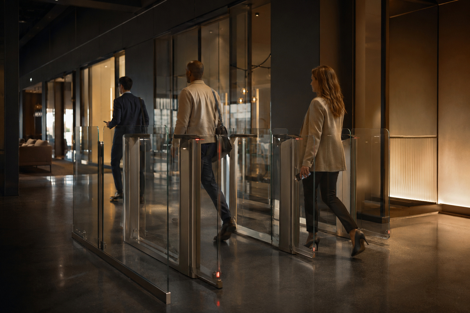
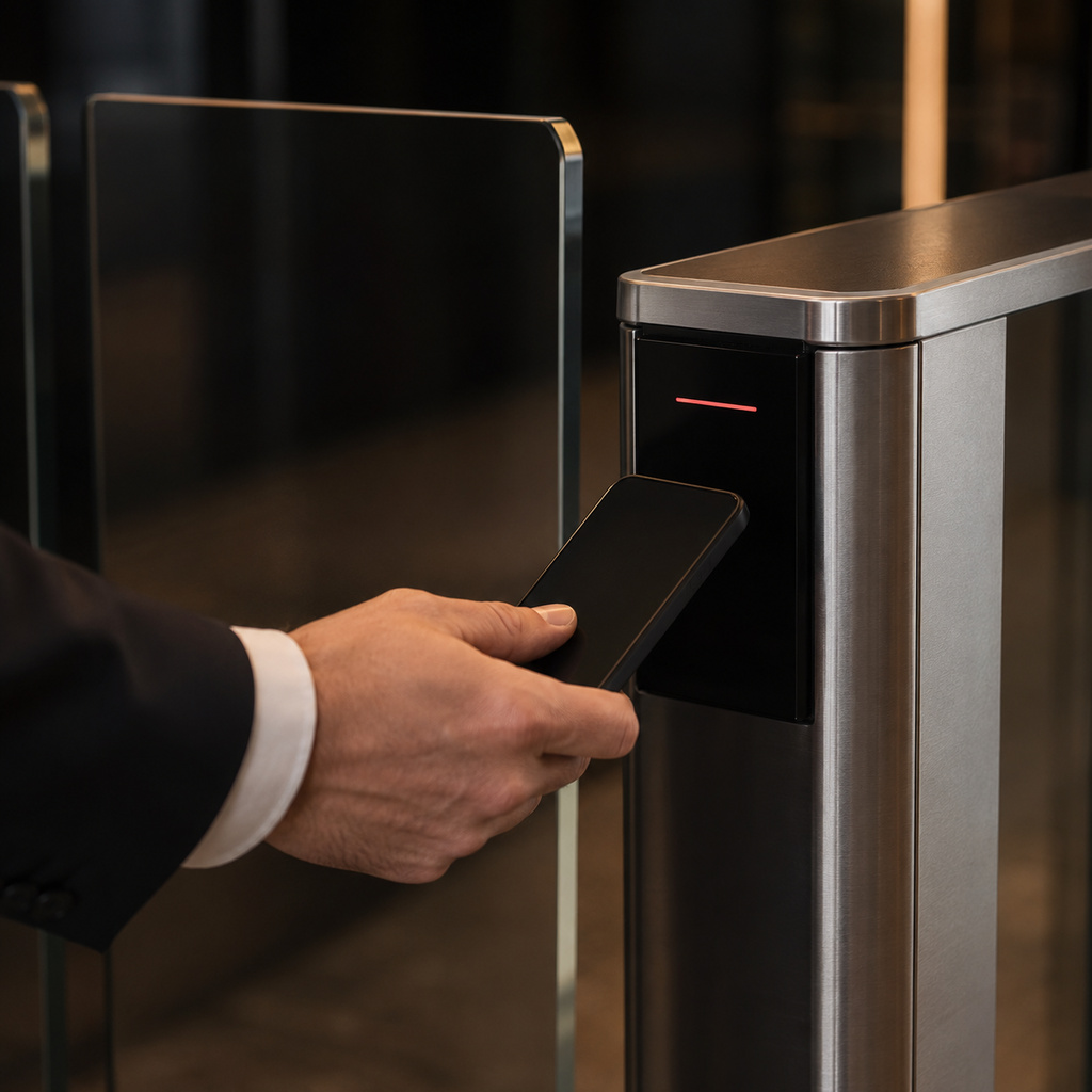
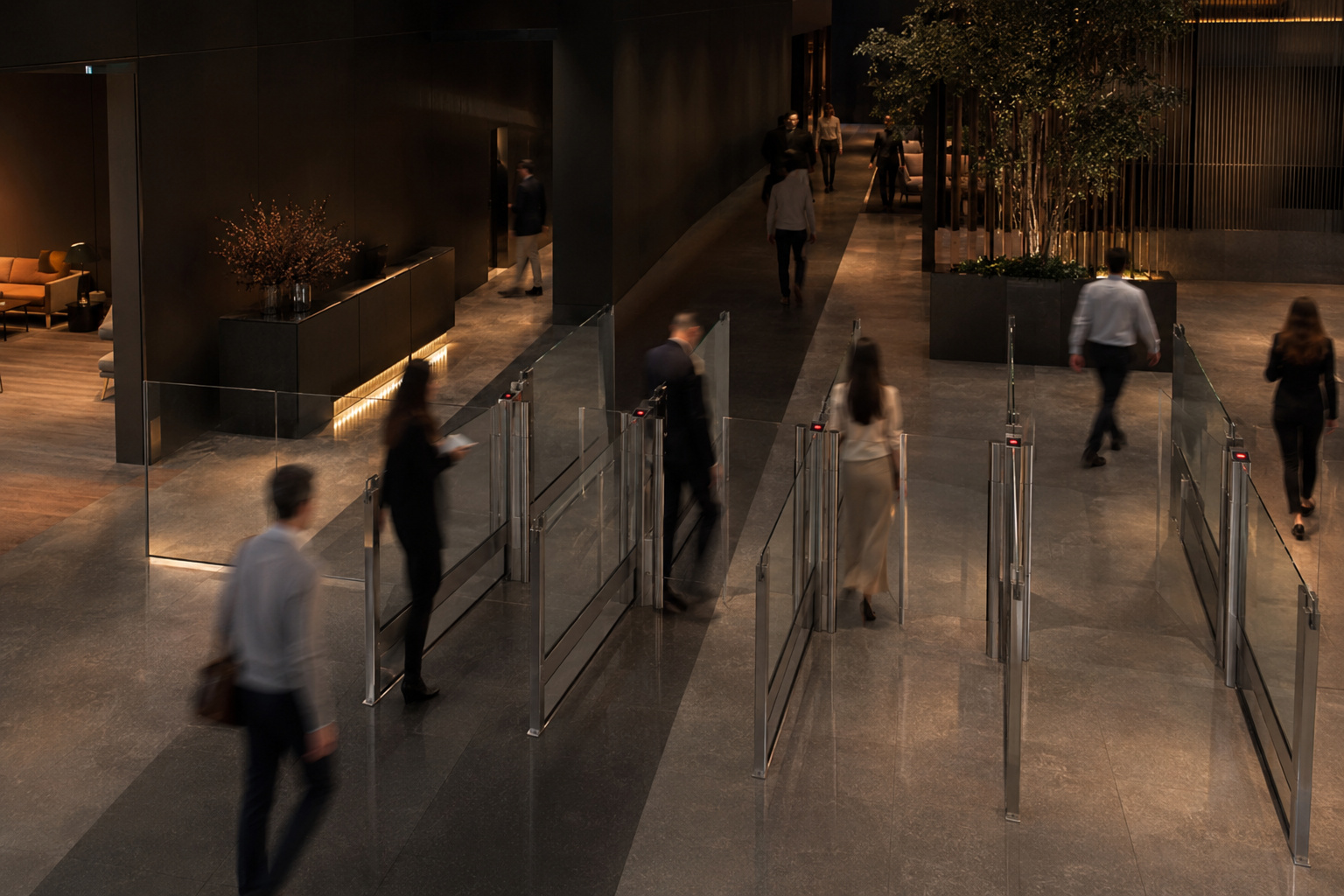
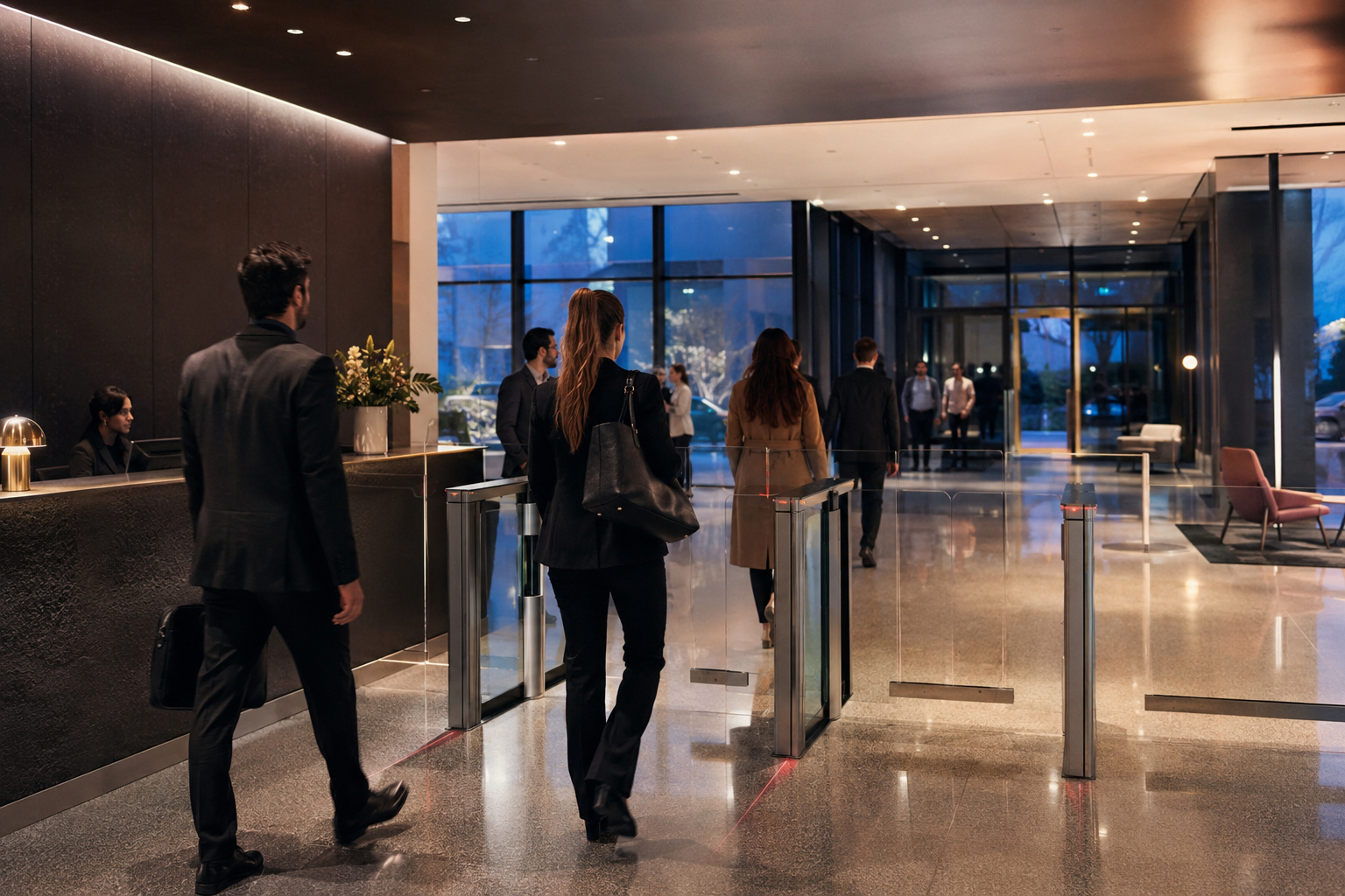
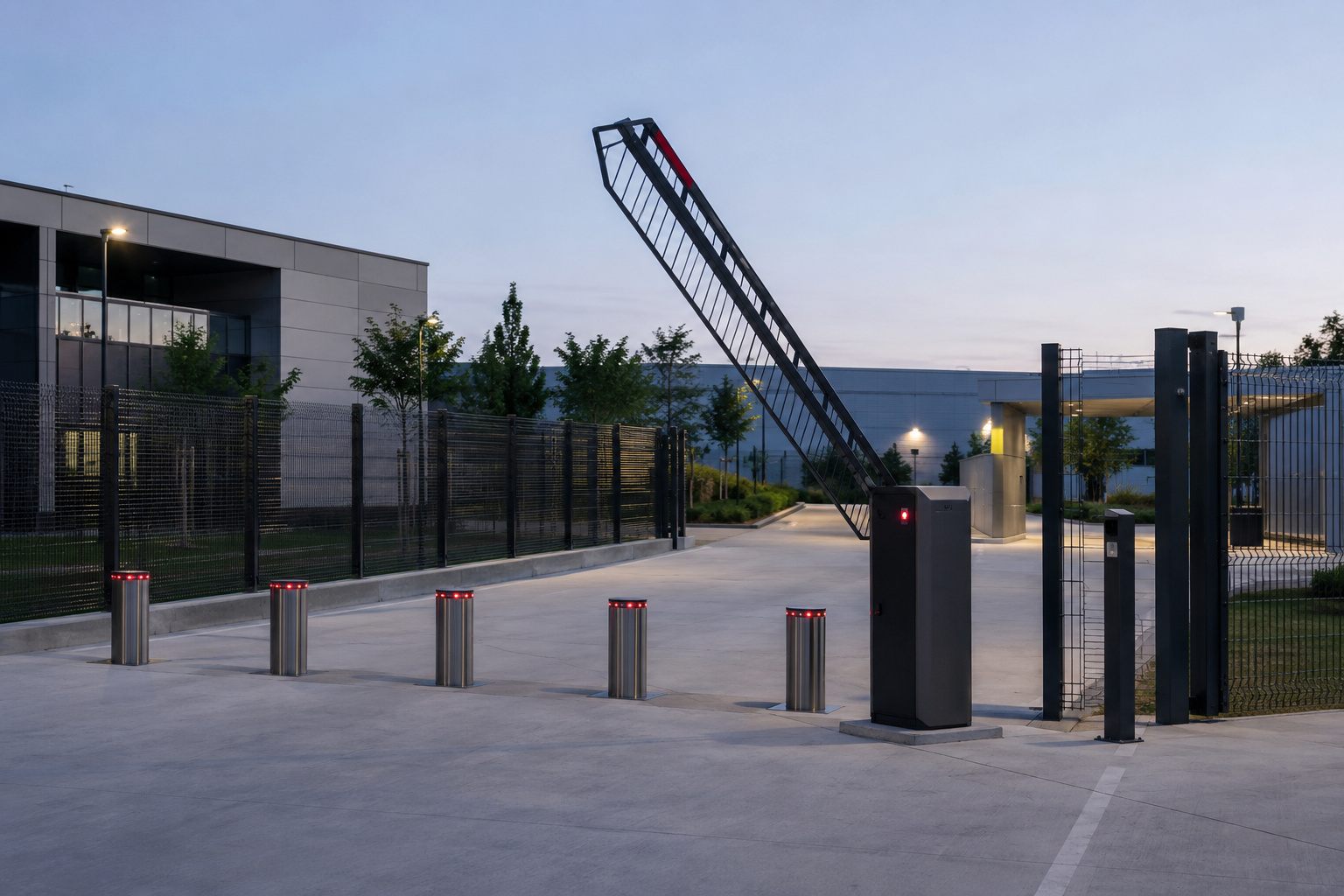
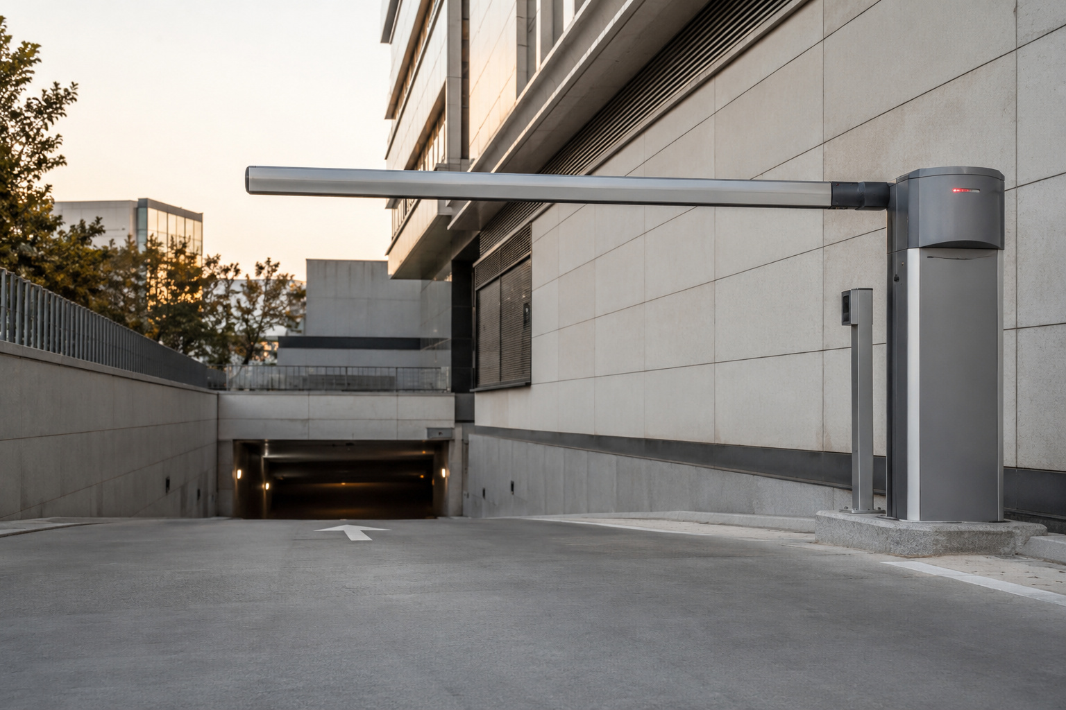
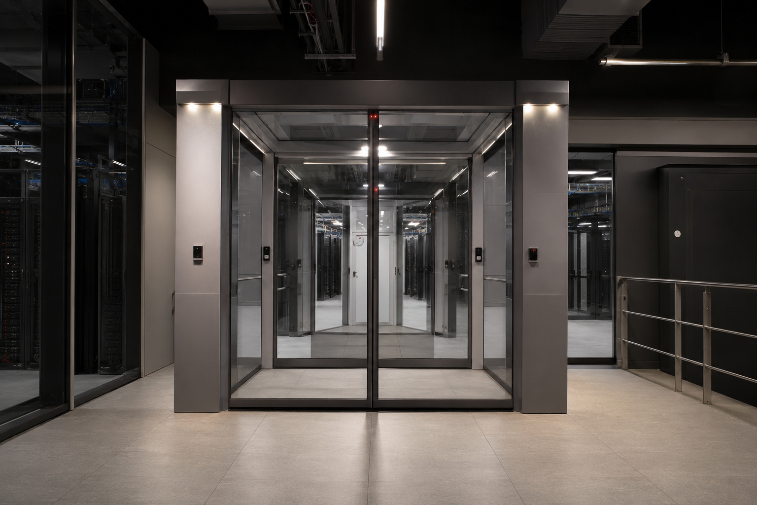
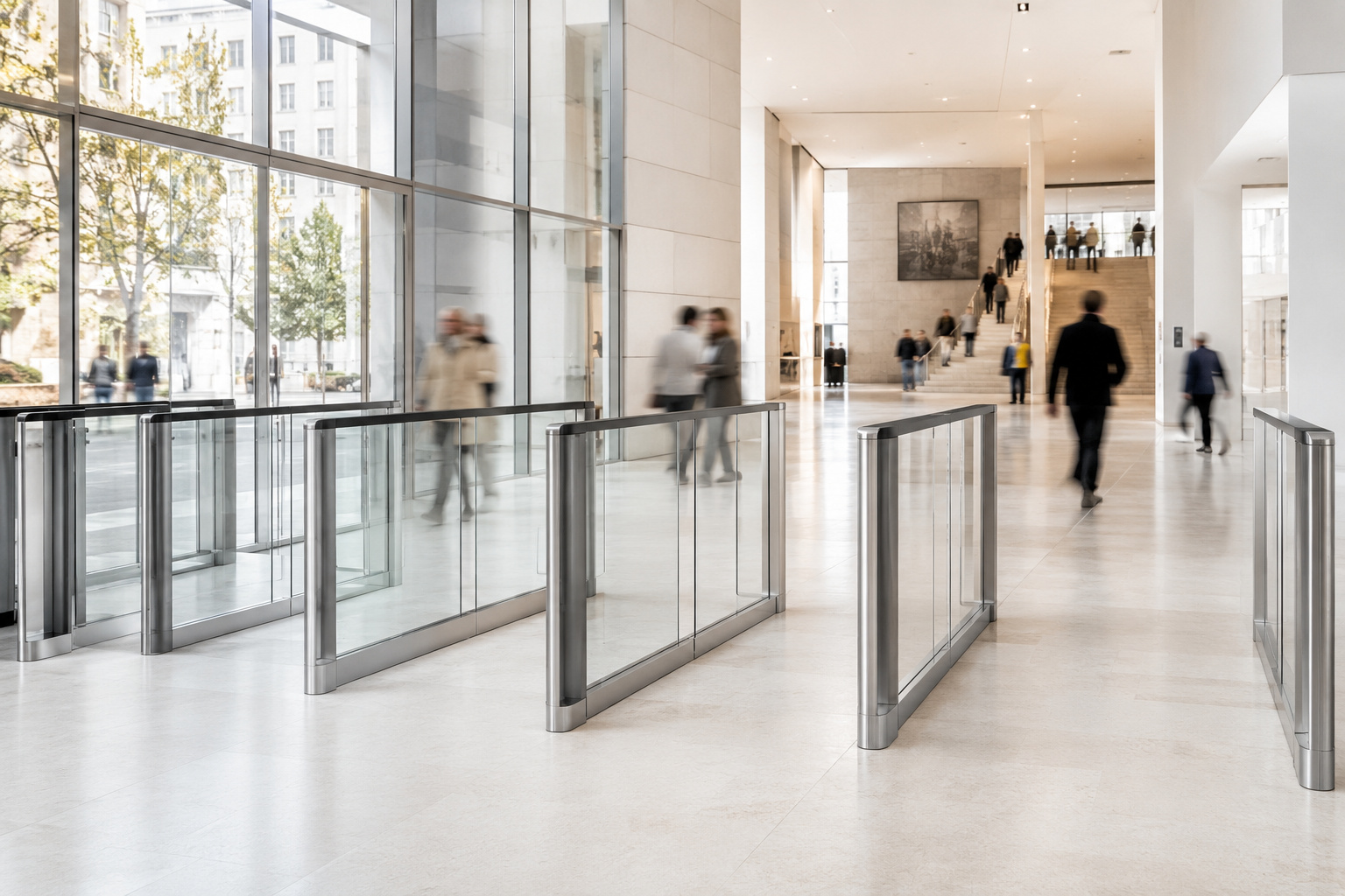
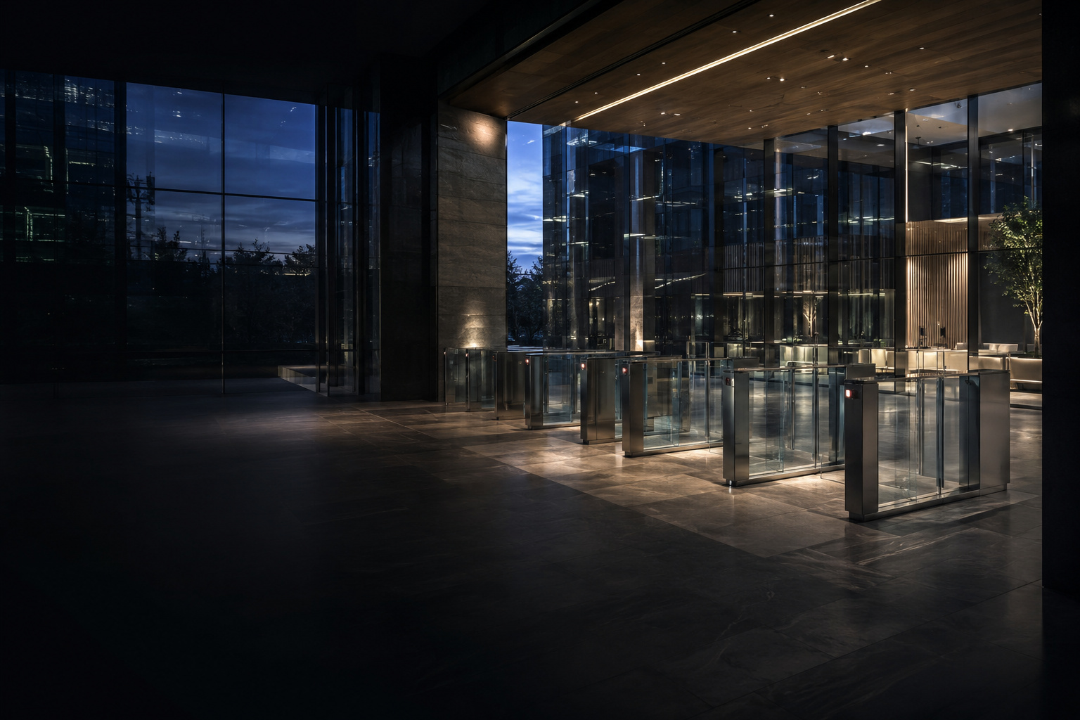
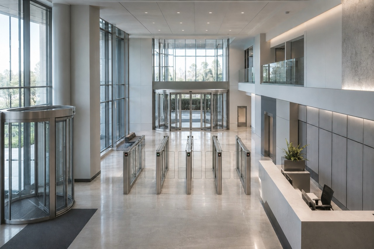
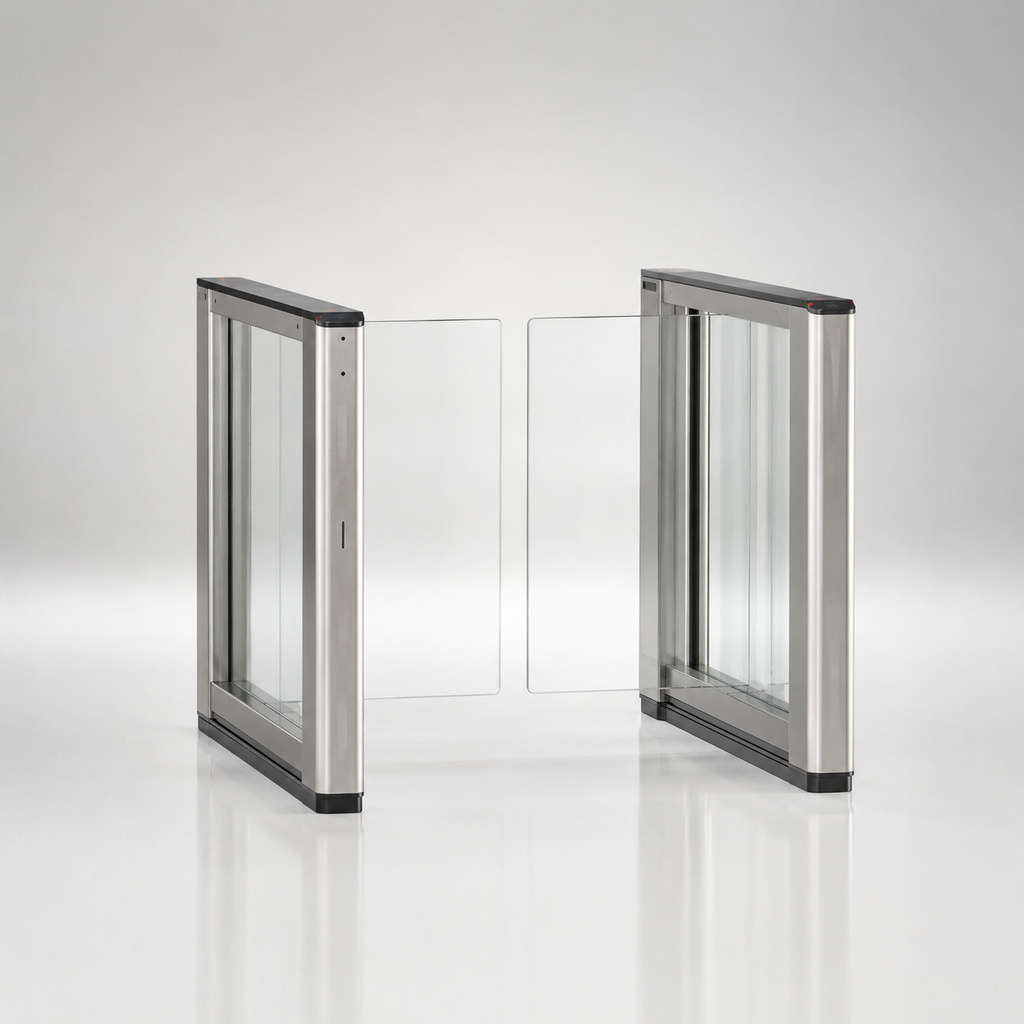
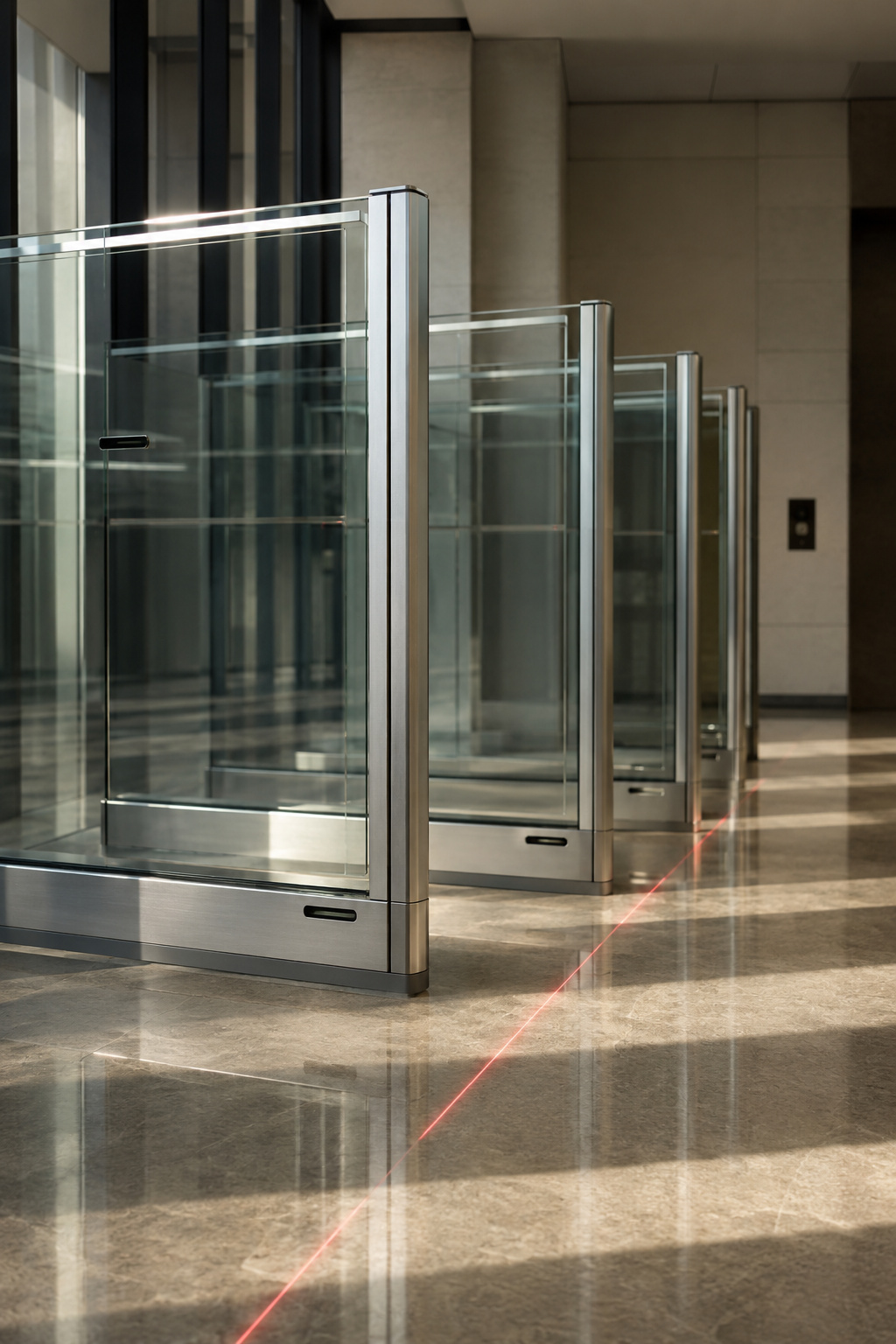
- Product photography, 3D renders & case studies are represented by art-direction placeholders here.
- SlimLane = flagship; AS1 = vehicle innovation proof.
- EASIER treated as an Automatic Systems passenger brand, not a separate entity.
- Region detection = explicit switch + optional geo-IP suggestion (INT / North America).
- Copy is directional English; localisation for EN·FR·DE·ES·NL.
Precision Flow
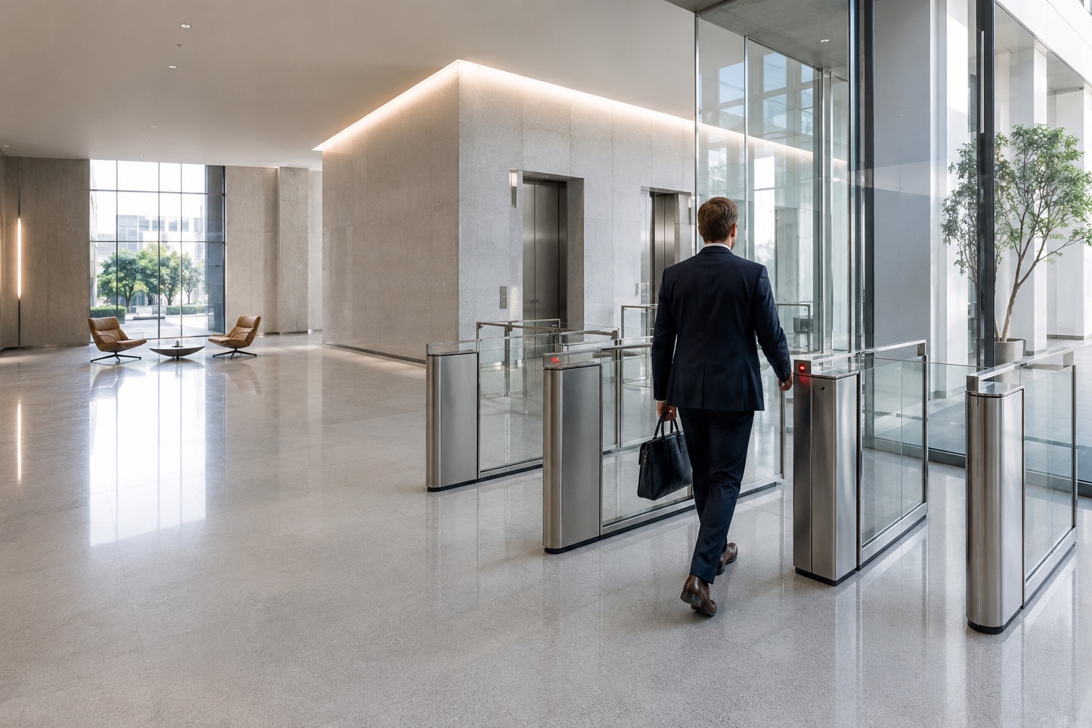
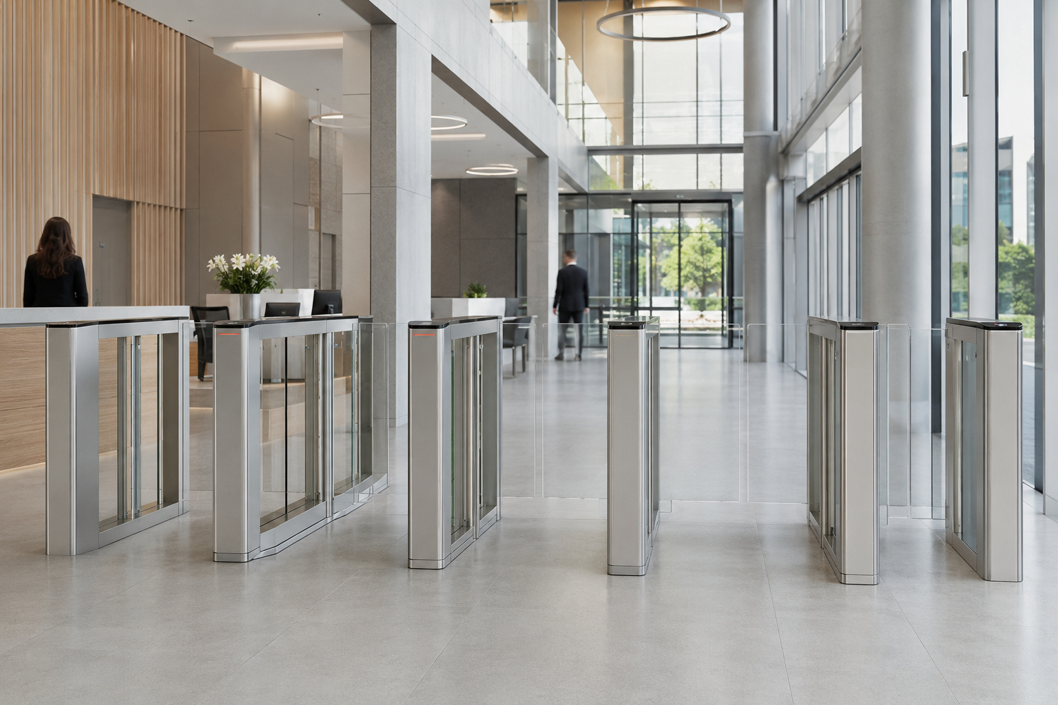
Premium, clear, corporate and international, the most credible direction for an executive committee. A light, engineered world where the historic red becomes a flow line that signals passage, control and navigation. Large product-in-context photography, hairline grids, tabular precision.

Architectural Experience
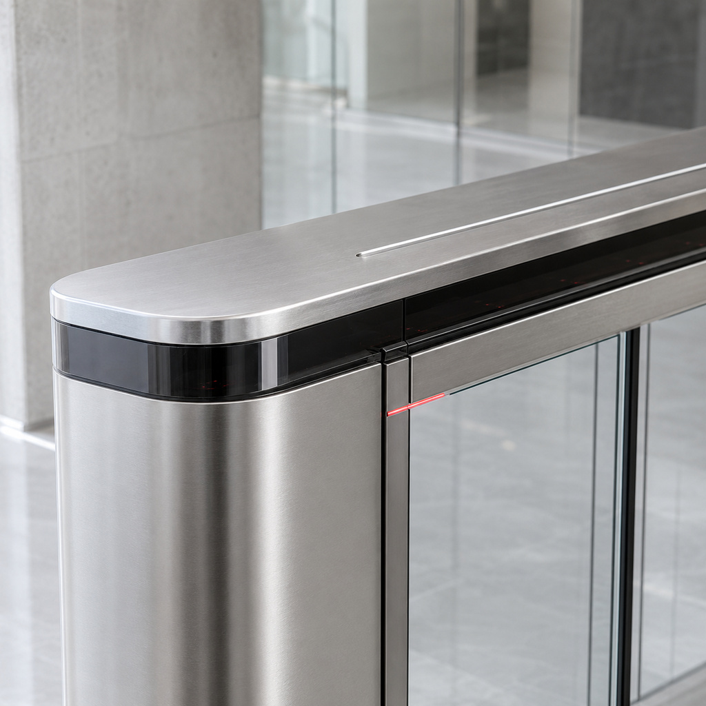
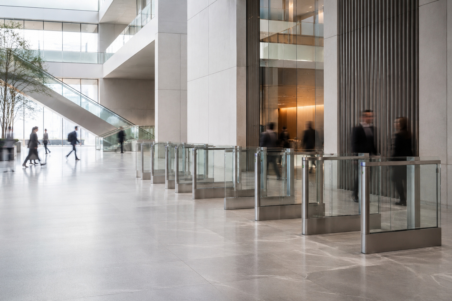
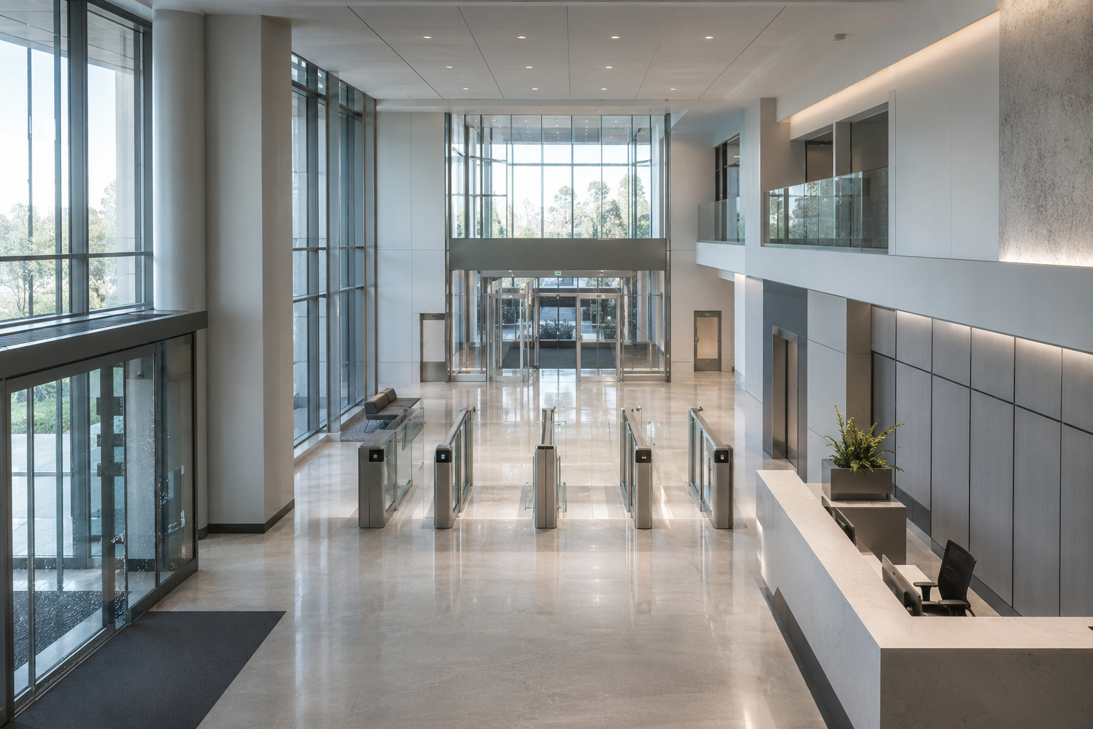
The most aesthetic and differentiating direction built for architects, specifiers and premium buildings. Editorial composition, large architectural imagery, glass / metal / light, and access explored by environment. Red becomes a refined signature. BIM, 3D & AR move to the centre.
The Human Standard
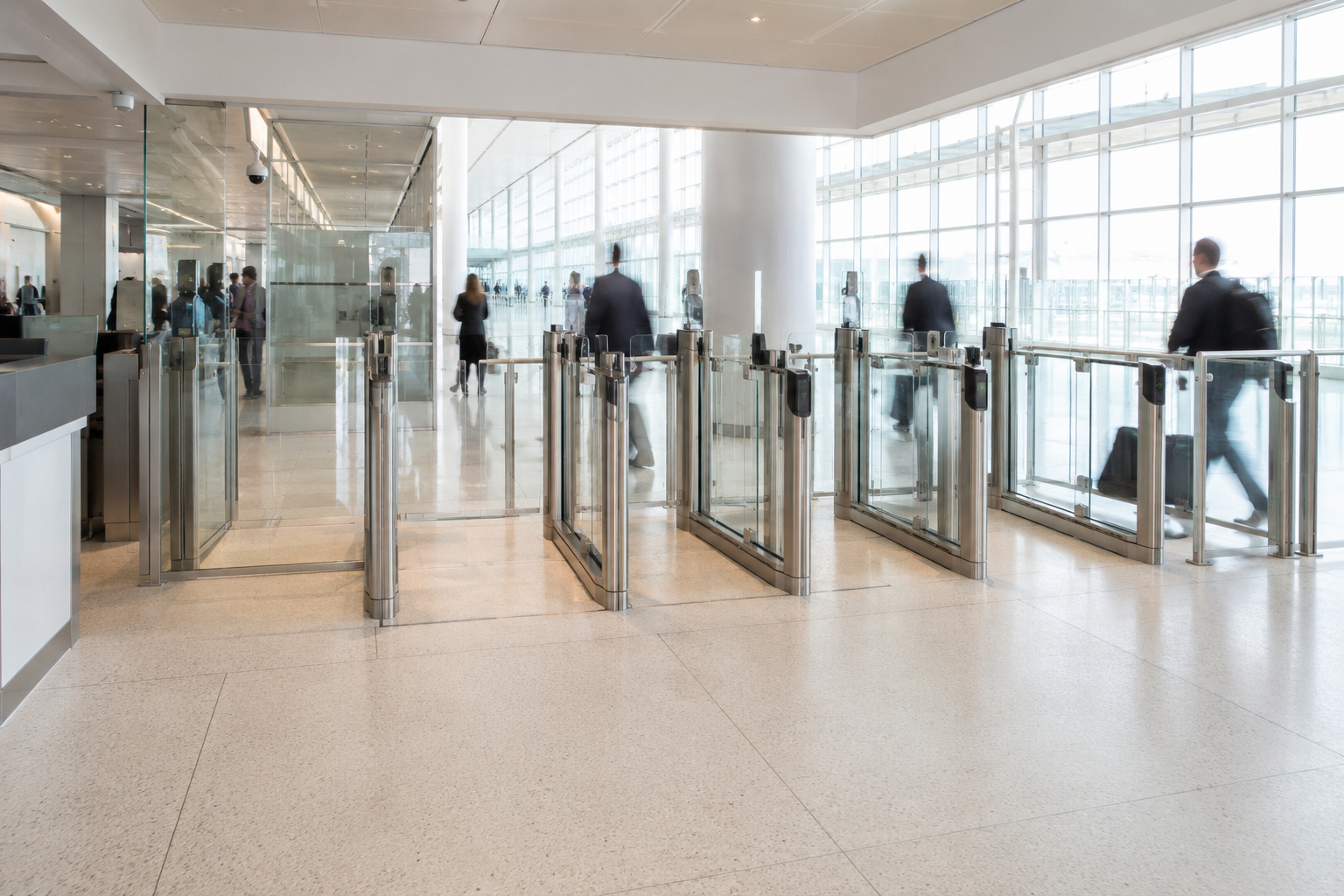
Dark, premium and editorial but corporate and human. Built on your own brand truth: the equipment is proven , it's designed around the people who cross it every day. Leads with everyday human experience, heritage (since 1969, 200,000+ entrances in daily use, 150+ countries) and a warm use of the historic red. The interaction is a corporate, solutions-first sector switcher.